About this report
Context
This report provides an overview of how accessible Sanity Studio is. Sanity Studio is Sanity's Content Management System (CMS), the environment where people create, edit and manage content.
Below, we will describe the methodology used and some specifics related to using WCAG 2.1 as a methology for assessing a CMS.
Methodology and process
We have used the WCAG-EM reporting methodology to carry out a WCAG 2.1, Level A + AA evaluation. This methodology is geared at websites, not content management systems—for the purposes of this review, we will follow the process as closely as possible.
Note: CMSes are sometimes evaluated using ATAG. Those guidelines are outside of the scope of this report.
The following process was used:
- define scope
- define used technologies
- select a representative sample
- audit the selected sample
- describe the evaluation findings
This evaluation encompasses all 50 requirements from the European accessibility norm EN 301 549 (= WCAG 2.1, Level A + AA Success Criteria).
Most of the evaluation is a manual process. For part of the Success Criteria, automated tools like axe-core and Firefox Developer Tools were used.
Notes specific to this report
Customizability
Sanity Studio is highly customizable: it can look and behave differently depending on where it is installed and what sort of customisations are applied. For this review, we have picked a demonstration instance of the Studio that uses a wide variety of Sanity features. This way, this evaluation should provide a representative overview of Sanity Studio accessibility. At the same time, with customisations, your specific level of accessibility may vary.
“Sample” selection
Given this report is about a single page application, we are using a very loose interpretation of “pages”, mostly to try and organise the report. For instance, we have marked some features of the CMS application, like the text editor, as sample pages, even if they are part of the same single page.
Content created with Sanity
This report is not about how accessible the content that is created with Sanity is, just about how accessible the system itself is.
Small print
- This report is a snapshot.
- The evaluation per Success Criterion is a falsification: “meets the Success Criterion” means we have not found any issues that would lead to “does not meet the Success Criterion”
- For each problem we give one or more examples, the same problem could appear in more places.
- This evaluation was carried out in the latest versions of Mozilla Firefox, Google Chrome, Apple Safari and Microsoft Edge.
Issues
- Error indication does not have alternative text (1.1.1)
- Images in Portable Text Editor lack alt attribute if no alternative is given (1.1.1)
- Icons in status info lack text alternatives (1.1.1)
- Images that indicate who is present / made changes has no text alternative (1.1.1)
- “Published” state icon has no text alternative (1.1.1)
- Consider marking up items in panels as lists (1.3.1)
- Description lists not marked up as description lists (1.3.1)
- Field descriptions not associated with fields (1.3.1)
- Rich text fields are multiline, but not marked up as such (1.3.1)
- List of SEO suggestions is not marked up as list (1.3.1)
- Active desk pane item has insufficient contrast (1.4.3)
- Publish button has insufficient contrast (1.4.3)
- Retry button has insufficient contrast (1.4.3)
- Focus outline does not have sufficient contrast (1.4.11)
- Tooltips cannot be dismissed without moving pointer or focus (1.4.13)
- Image menu does not indicate expanded state / controls property (2.1.1)
- Cannot get to text editor popover with with just a keyboard (2.1.1)
- Cannot edit sorting or layout with just a keyboard (2.1.1)
- Cannot open desk pane with just a keyboard (2.1.1)
- Cannot close image menu with just a keyboard (2.1.1)
- Cropping an image requires a mouse (2.1.1)
- Cannot access error messages with only a keyboard (2.1.1)
- Cannot get to “Preview” pane with just a keyboard (2.1.1)
- No mechanism to jump to specific parts of the studio (2.4.1)
- All pages have the same title (2.4.2)
- When new panel opens, visual behavior does not match keyboard/screenreader behavior (2.4.3)
- Focus not visible in high contrast mode (2.4.7)
- Desk structure has focusable element that is not visible (2.4.7)
- When sorting categories using drag and drop, pointer action cannot be cancelled (2.5.2)
- Language declaration missing in studio (3.1.1)
- Language declaration missing on login page (3.1.1)
- Error messages are not always available (3.3.1)
- List items not marked up as list items (4.1.1)
- Current menu item indication uses invalid ARIA (4.1.1)
- Text editor buttons have no names (4.1.2)
- Category drag and drop handle has no accessible name (4.1.2)
- Dropdown button has no accessible name (4.1.2)
- Menu links don't have accessible name (4.1.2)
- Text editor popover options do not have accessible name (4.1.2)
- Preview buttons do not have accessible names (4.1.2)
- Rich text fields lack label (4.1.2)
- Update button does not have accessible name (4.1.2)
Error indication does not have alternative text
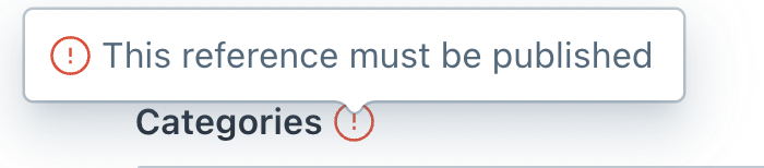
Problem
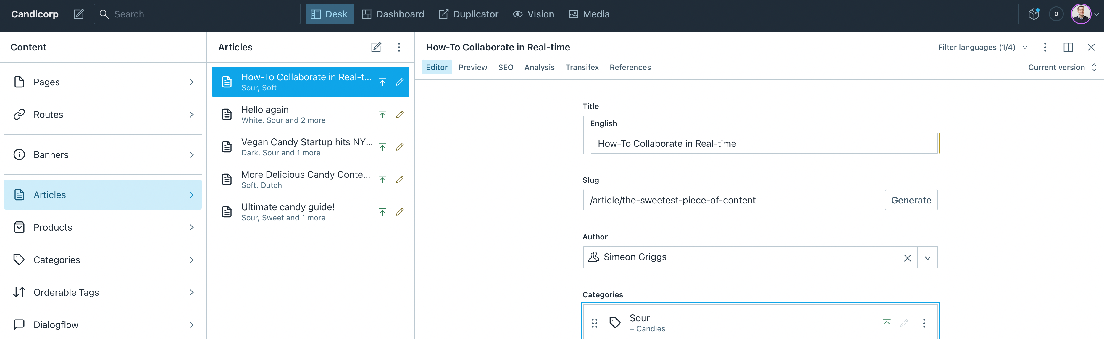
In the Categories field in article pages, an error icon is shown when the field is in error. There is no text alternative for this field.
Solution
Add a text alternative like “error”. This can be added as a title element within the svg element or as visually hidden content adjacent to the SVG (in that case, add aria-hidden="true" and role="presentation" to the SVG so that it is removed from the accessibility tree).
Images in Portable Text Editor lack alt attribute if no alternative is given

Problem
Under Content, Articles, How to collaborate in real time, editors can add images to the content. If they don't add an alternative text to these images, they are rendered without an alt attribute. A missing alt attribute will trigger some screenreaders to read out the full URL of the image asset, which is undesired.
Solution
Render alt="" if no alternative text is provided.
Icons in status info lack text alternatives
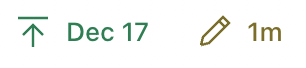
Problem
In the status bar on the editing screen, there is a last published date and info on when the item was last changed. The icons commnunicate the difference between these bits of data, but they don't have a text alternative that communicates the same. This makes it hard to know or guess for someone who cannot see the icons.
Solution
Add alternative text to the two icons that communicate the same info, maybe so that together with the existing text they are the same text that is in the tooltips that are shown on however? Eg the published icon could have an alternative of “Last published”.
The alternative can be added to the inline SVG by adding a <title> element inside of the <svg> element. To be sure, also add arial-labelledby to the <svg> element, referring to the id attribute of the <title>. This is due to that some browsers have a bug because of which just the <title> would be ignored in this context.
Images that indicate who is present / made changes has no text alternative

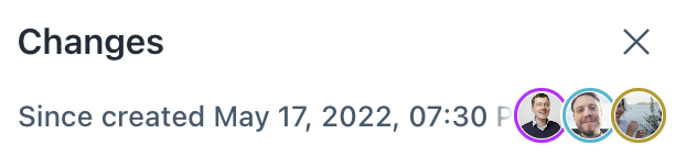
Problem
In the top bar there is an indication of which team members are currently present. There are images of people, but there is no alternative. Non-sighted users can not know who is present.
Solution
For “Who is present”, a couple of changes would make this better:
- the button that opens the 'who else is here' menu needs an accessible name, eg 'who is here'
- the image would need to be marked as not relevant to assistive technologies, eg with
aria-hidden="true"
For who has made changes:
- each avatar should probably get its own text alternative with name of the user; as these are
<image> elements within an <svg>, probably want a <title> as the first child of the <svg>
“Published” state icon has no text alternative
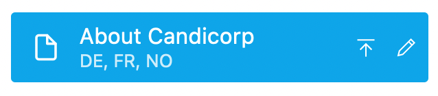
Problem
Desk pane items display a special icon to indicate that they are published items. This “Published” indicator has no alternative text. There is a ”Published” tooltip shown when hovering the icon, but that content is not permanent.
Solution
Add a text alternative to the icon, for instance by adding a <title> element inside of the <svg> (for maximum compatibility, also add aria-labelledby to the <svg> referring to the <title>).
Alternatively, you could also add “Published” to the accessible name of the link, so that it is something like “About Candicorp, DE, FR, NO, Published”.
Repeat
This issue is also in a few other places where the published state is indicated, like in the editor for a list of tags in articles.
Consider marking up items in panels as lists
Problem
Items in panes are marked up as div elements. Semantically, they could be seen as lists. If they were marked up as lists, screenreaders would announce something like “list, x items”, which may be a helpful indication of what to expect.
Solution
Consider marking up pane items with li elements surrounded by a ol or ul element. This would the hr elements in between impossible, so that would need to be done with CSS on the lis (if that's worth it).
Description lists not marked up as description lists
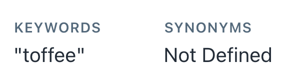
Problem
In the SEO tab for articles, two key value pairs are displayed. Their relationship cannot be programmatically determined.
Solution
Use a dl (description list) element with a dt for the keys and dd for the values.
Field descriptions not associated with fields
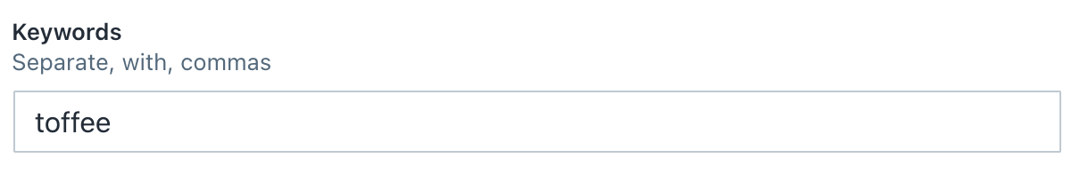
Problem
In the editor, some fields, like the Keywords field in the SEO panel, have a description in addition to just a label. This description is not associated with the field in code. This makes it harder to discover for some users, including screenreader users.
Solution
Associate the descriptions with their field by using aria-describedby on the input element, with the ID of the decsription as the value, so aria-describedby="keywords-description", where the description has <div id="keywords-description"/> (any ID is fine, just needs to be the same between the associated id and aria-describedby attributes).
Rich text fields are multiline, but not marked up as such
Problem
In the editor for articles, there are rich text fields. They are marked up as text fields with role="textbox", but do not have aria-multiline="true". As they do allow for multiple lines, this attribute should be added to set the right expectations.
Solution
Add aria-multiline="true" to portable text editors.
Resources
List of SEO suggestions is not marked up as list
Problem
In the SEO tab on article editor pages, a list of suggestions is provided. This list is marked up with div elements, but semantically it is a list. Because of this, the visual semantics do not match the semantics in the code, which could be confusing for users of screenreaders, voice control and other assistive technologies.
Solution
Use a ul (unordered list) or ol (ordered list) to mark up the suggestions.
Active desk pane item has insufficient contrast
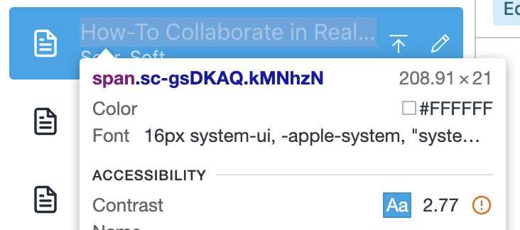
Problem
Desk pane items get a different color when they are active. The blue background color and white text have a contrast of 2.77 : 1, which is insufficient.
Solution
Use colors with a contrast of at least 4.5 : 1.
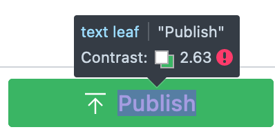
Problem
When changes are made in the current editor, the publish button has white text on a green background. The green and white text have a contrast of 2.63 : 1, which is insufficient.
Solution
Use colors with a contrast of at least 4.5 : 1.
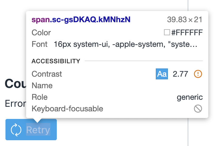
Problem
When data fails to load, a “Retry” button is displayed. The light blue and white text have a contrast of 2.77 : 1, which is insufficient.
Solution
Use colors with a contrast of at least 4.5 : 1.
Focus outline does not have sufficient contrast
Problem
When text fields have focus, this state is indicated with a blue (#0ea5e9) outline. This outline has insufficient contrast with the background (2.77 : 1).
Solution
Ensure the outline has a contrast of at least 3 : 1.
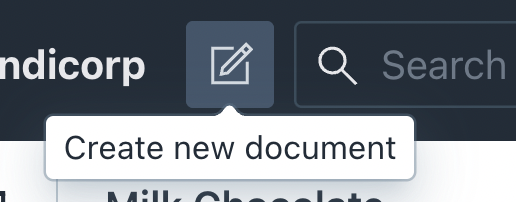
Problem
On some buttons, like the “Create document” button, a tooltip will display when it is hovered. These tooltips can only be dismissed by moving the mouse cursor or focus away from the button.
Solution
Also allow for the tooltip to be dismissed on Escape.
Image menu does not indicate expanded state / controls property
Problem
In image blocks, a “kebab” menu is available with options like Replace, Download and Clear. The button that opens this menu does not include an aria-expanded attribute to indicate whether it is opened, and also lacks the aria-controls property to specify which menu it opens (unlike aria-expanded, aria-controls may not benefit end users, but also does not hurt to have in place).
Solution
Add the aria-expanded attribute to the button, set to true (when open) or false (when closed).
Add the aria-controls attribute to the button, referring to the associated menu by the ID of that menu's containing element.
Cannot get to text editor popover with with just a keyboard
Problem
In the rich text editor, when some text is marked up to be a link, a popover is displayed with options for changing and removing. Users of just a keyboard cannot reach this popover and therefore not these options.
Solution
This is tricky, as in text editing context Tab is already used to insert a tab in the content and indent list items. Consider supporting Shift + Tab or Shift + up arrow to allow the user to get into the popover.
Cannot edit sorting or layout with just a keyboard
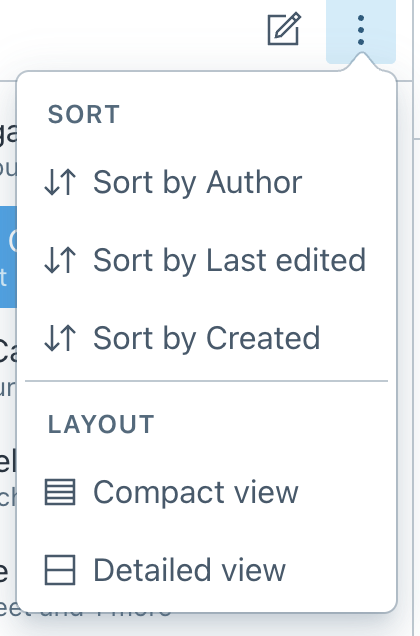
Problem
In some panes, a “kebab” menu is available to set sorting and layout preferences. The menu can be opened with just a keyboard, but the preferences inside of it cannot be accessed.
Solution
The preference buttons have tabindex="-1", this prevents them from being tabbed to. Removing the attribute would put them back into Tab order, but tabs may not be the best way to access these options, especially if there are many. Instead of tabs, up and down arrows may be better here, like in some other similar menus in Sanity Studio.
Cannot open desk pane with just a keyboard
Problem
Desk panes can be closed. When they are closed, there is no way to open them using just a keyboard.
Solution
Currently there is a click event on the box with the pane's name that toggles it. It would probably be best to use a <button> for this toggle, that is styled to look like the pane's name now. Advantages of a button: can be used with keyboard, is announced as button, can have accessible name (like “toggle pane X” or similar). Alternatively, you can listen to a key* event as well as a click event, but would need to find a way to make the element focusable and nameable.
Problem
In image blocks, a “kebab” menu is available with options like Replace, Download and Clear. This menu can be opened with just a keyboard, but it cannot be closed with just a keyboard.
Solution
Update the closing behaviour, such that the menu closes when the button loses focus or the Escape key is used while on the button or one of the items.
It seems like this particular menu works differently from others like it, it may just need updating to how the others work? (Others can be closed with Escape).
Cropping an image requires a mouse
Problem
There is currently no way to crop images without a mouse.
Solution
There is no quick fix to this, there may be ways to make it possible with a keyboard.
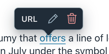
Cannot access error messages with only a keyboard
Problem
In the Categories field in article pages, when the field is in error, the error message is displayed via a tooltip. This tooltip cannot be reached by users of only a keyboard.
Solution
Normally the recommendation would be to make the error indicator a button that displays the tooltip on focus, but under 3.3.1 we suggest making the error message available as inline text, in which case this issue no longer applies.
Cannot get to “Preview” pane with just a keyboard
Problem
When editing content, a Preview pane is available. When it is clicked, the Preview pane opens. When I am focused on the Editor tab and want to use my keyboard to get to the Preview tab, I am stuck, as the next tab stop is the “Current version” dropdown and arrow keys don't have an effect.
This may be a bug of sorts, as when trying it out I did occassionally land on the Preview tab, but I am not sure what I did to get there. On the Sanity UI Tabs example I can move between Content and Preview with arrow keys.
Solution
Ensure that the Preview pane can be reached either by tabbing there or by using the right arrow key.
No mechanism to jump to specific parts of the studio
Problem
On each page in the studio, a lot of the content stays the same, like the first and second desk panes. If someone would use just a keyboard, they would need to browse around a lot to get to where they want, as there is no mechanism to jump to specific parts of the studio.
Solution
There are various ways to address this, including adding some “skip links” to the start of the document that allow jumping to specific parts.
Something else that would help is to add some structure with landmarks and headings:
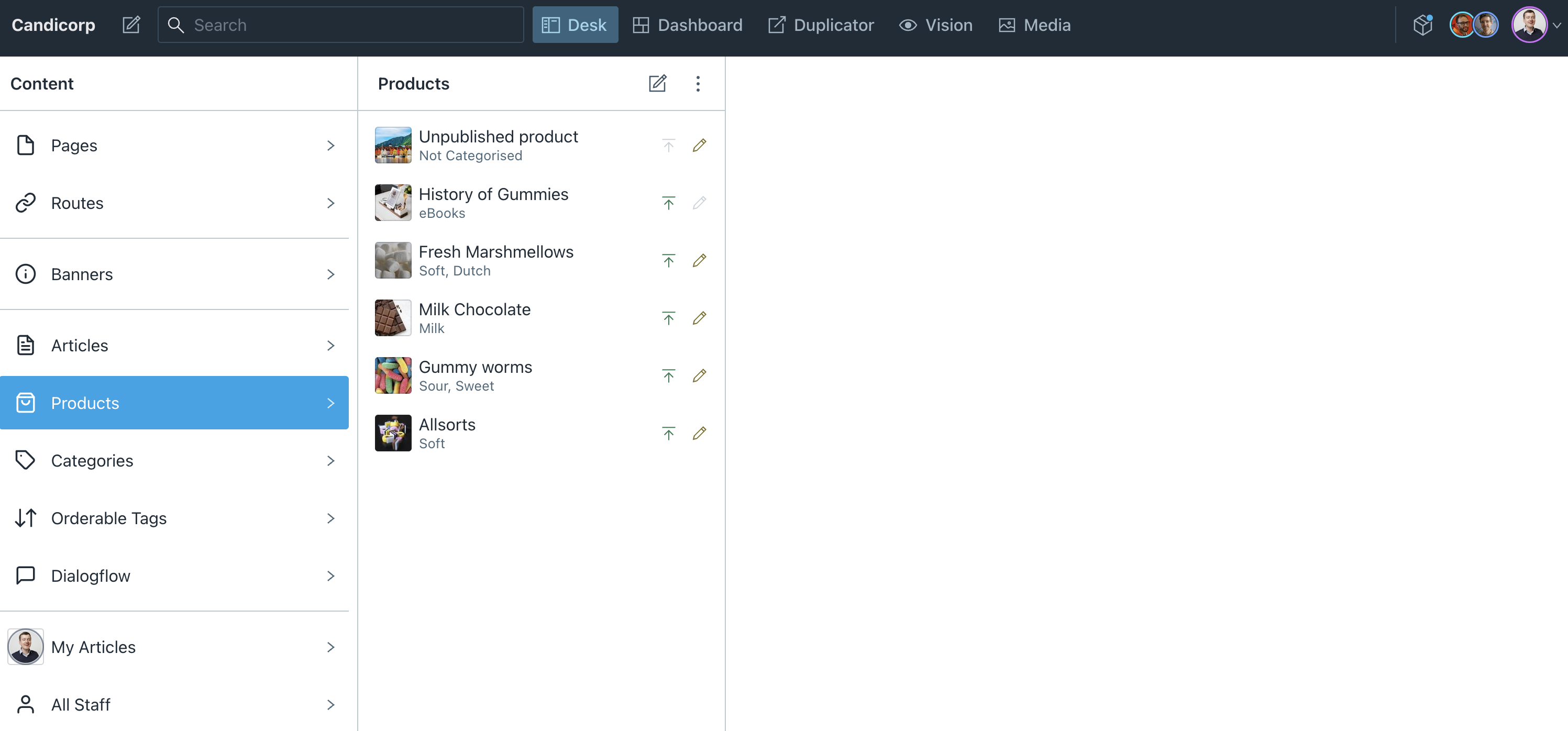
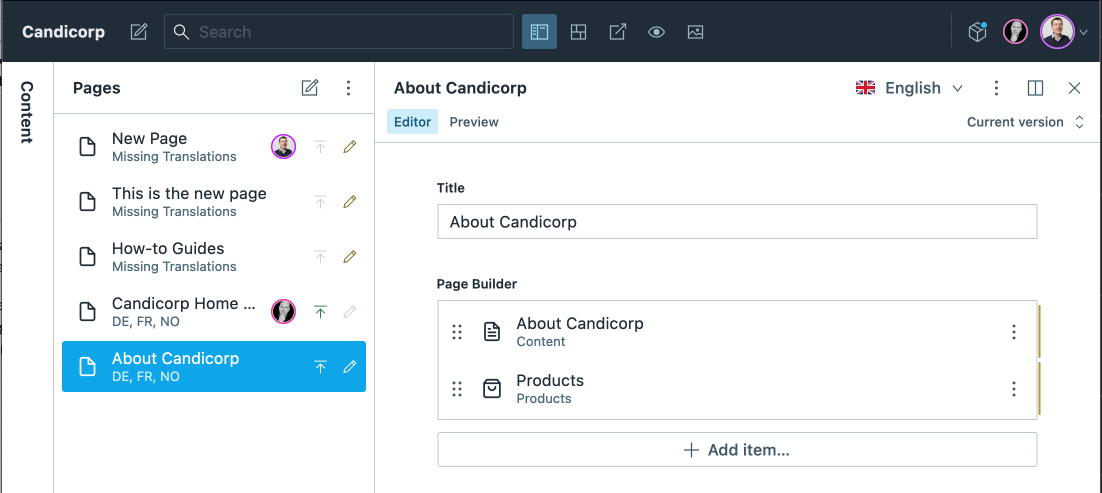
- Make the names of each panel in the desk structure headings. Screenreaders can pull up a list of headings, and this way, people could jump straight to each panel. Eg in the screenshot above I would expect to find
h2's (or other h*) for Content, Articles and ”How to collaborate in real time”, they would basically shortcuts to those areas.
- Divide up the page in landmarks for the main parts of the UI, which are probably: Header, navigation (desk, dashboard, vision etc), section 'content', section 'articles', section 'current document: how-to collaborate in real time', and within that last one, section 'tabs' (?), section 'status/document options'.
The combination of these two would give screenreader users better means to navigate around.
Something that would also help is to have skip links, but this may be trickier to do as one the initial state has no desk panels open?
Resoruces
All pages have the same title
Problem
All pages have “Candicorp - Sanity” as their title (contents of the <title> element). That is too generic, this way they don't describe specifically which page someone has ended up on, which would be the user expectation, at least when following links.
In a multi page application, screenreaders would usually read out the contents of the <title> element as the first thing when a page loads. That provides users with a reassurance that they've ended up on the right page, eg on Vision, not Dashboard, or on Articles, not Products.
Solution
Update the <title> element to be more specific to the current route every time a user follows a link in the applications. In the title structure, make sure the most unique thing is mentioned first, this makes it easier for screenreader users to skip over to the next announcement as soon as they know enough. For instance, the title structure could be something like (based on current situation):
- Candicorp - Sanity
- Pages - Content - Candicorp - Sanity
- About Candicorp - Pages - Content - Candicorp - Sanity
- Vision - Candicorp - Sanity
When new panel opens, visual behavior does not match keyboard/screenreader behavior
Problem
When content is selected in the desk, a new panel opens. Visually, it makes sense to then look at the newly opened panel, and it is designed in a way that makes that apparent.
When using a keyboard or screenreader, things are less obvious. When selecting an item in one desk pane, keyboard focus stays on that item, while one would expect it to move to the newly opened desk pane.
Solution
When opening a desk pane, move focus to that pane. For keyboard users, their next tab is then in that pane, rather than in the pane they were in, and for screenreader users they move to a more logical place based on the item they've picked.
Ideally, one would also be able to get back to the previous pane with Shift + Tab.
You could also consider allowing arrow navigation within each pane, so that users would effectively tab between panes (the ones that have lists, not the one with the editor).
Focus not visible in high contrast mode
Problem
When High Contrast Mode is used (this can be emulated in Chromium Dev Tools with the Emulate Forced Colors setting to Enabled), focus styles are not visible. This is because the outline is set with box-shadow, while the outline property is set to none. In High Contrast Mode, box-shadow is ignored and outline used as a fallback.
Solution
Set outline-color to transparent instead of outline to none. This way, high contrast modes can force it to be some other color like black, rather than not rendering it at all, while users without high contrast modes will not see the outline (and they will see the box-shadow alternative instead).
It may be good to set the border-color of these inputs also to transparent instead of using border: 0, so that a border is rendered in high contrast mode.
Desk structure has focusable element that is not visible
Problem
When tabbing from the first column in the desk structure to the second, this element receives focus but this focus is not visible):
<div data-ui="Text" tabindex="0" class="sc-bdvvtL exNLxS sc-hudTXT hYyGMv"><span><span class="sc-gsDKAQ kMNhzN">Pages</span></span></div>
Solution
It seems like this element is focusable so that scripts can send focus there. Probably best change the tabindex to be -1, so that is remains focusable for scripts, but not for keyboard users.
When sorting categories using drag and drop, pointer action cannot be cancelled
Problem
In the editor for Articles, the order of categories can be changed using drag and drop. When a user drags a category to a new position, then moves the pointer outside of the categories list, the new position is still applied. This is problematic for some users with visual disabilities, cognitive limitations and motor impairments and could cause people to be disoriented.
Solution
Cancel the reordering when the user drags outside of the categories.
Resources
Language declaration missing in studio
Problem
The login page does not include a lang attribute on the <html>, so software cannot detect the language of this page.
Solution
Add a lang attribute to the <html> tag, for example lang="en".
Repeat
This is also an issue in the main studio.
Language declaration missing on login page
Problem
The login page does not include a lang attribute on the <html>, so software cannot detect the language of this page.
Solution
Add a lang attribute to the <html> tag, for example lang="en".
Repeat
This is also an issue in the main studio.
Error messages are not always available
Problem
In the Categories field in article pages, when the field is in error, the error message is displayed via a tooltip. This means it is not always available and may not be discoverable to users of screenreaders and other assistive technologies.
Solution
Make the error message available as inline text or create an obvious way users can discover and expand the error message.
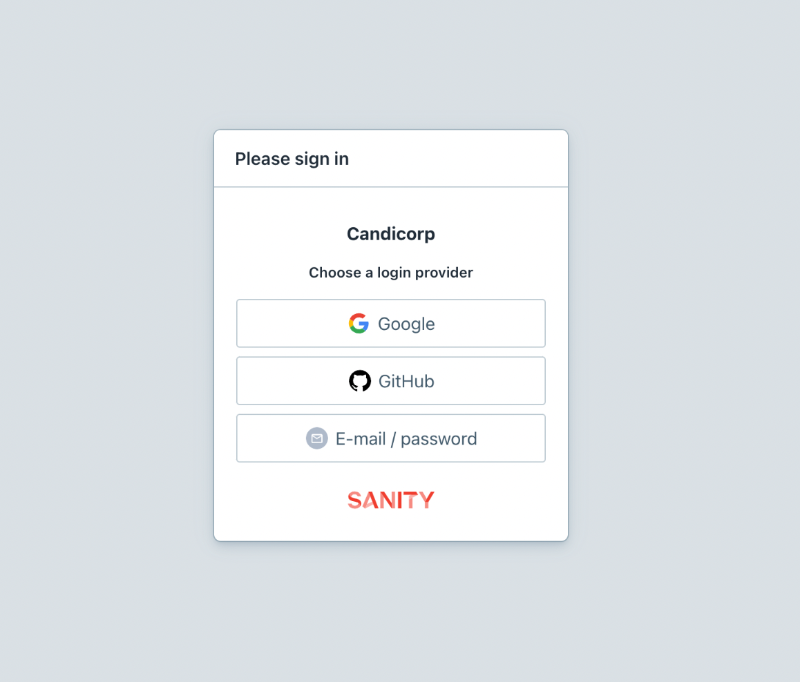
List items not marked up as list items
Problem
The login page has a list of login options that is marked up as a <ul> element. The direct children of this tag are <button> elements, but according to the HTML specification <ul>s can only contain <li> elements.
Solution
Wrap the buttons in <li>-elements.
Related success criteria
This is also a failure of 1.3.1.
Problem
In the menu bar, the currently selected item is indicated with aria-selected="true|false". This ARIA state is only allowed on gridcells, options, rows and tabs.
Solution
Use aria-current="true|false".
Resources
Text editor buttons have no names

Problem
In the text editor, there are buttons to change text styles, like to set the type of text (Normal, Heading 2, etc), bold text, italic and more.
These buttons do not have accessible names, which makes them impossible to distinguish for some users of screenreaders. For example, using VoiceOver on MacOS, the buttons are announced as:
- normal, menu popup collapsed
- button, group
- button, group
- button, group
- button, group
- button, group
- insert image (block), button, group
- menu popup collapsed, button, group
(the words “normal”, in the first, and “insert image”, are there because they are included as text). Especially the items announced as “button, group” are impossible to distinguish, but all of them could be much clearer.
Solution
Add an explicit accessible name to the buttons, for instance by adding (hidden) text inside of it or adding the aria-label attribute to the button.
Choose labels that make the action clear. This would be a better set of screenreader announcements:
- Text style, menu popup collapsed
- Bold, button, group
- Italic, button, group
- Unordered list, button, group
- Ordered list, button, group
- Link, button, group
- Insert image (block), button, group
- Other blocks, menu popup collapsed, button, group
which you could add with aria-label="Text style", aria-label="Bold" etc.
Another way could be to reuse the tooltips that show on hover; they are not calculated as part of the accessible name in the tested browsers, likely because they are only added into the DOM when shown.
Resources
Category drag and drop handle has no accessible name
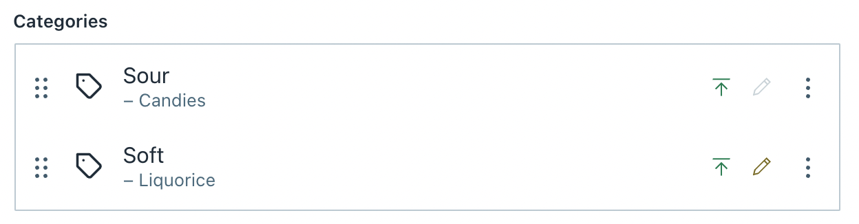
Problem
When editing an article, there is a category selection field, with a drag and drop handle in front of each item. This handle does not have an accessible name.
Solution
Add an explicit accessible name to the button, for instance by adding (hidden) text inside of it or adding the aria-label attribute to the button.
Not sure what the perfect text would be, maybe something like “start reordering”, as that would also work when people use it with just a keyboard. And then it should be specific to each item, eg “start reordering from Sour - candles”, “start reordering from soft - liquorice”, so that people who cannot see this can know where they are reordering.
It would also be helpful to add a relevant instruction on what will happen, “currently in position 3; press up arrow to move to position 2, down arrow to move to position 4.” This may seem like a lot, but it would probably make for a basic version of operating this control without seeing it?
Resources
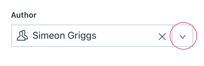
Problem
When editing an article, there is a dropdown to select an author. The dropdown has a button that can be pressed to open suggestions. This button does not have an accessible name.
Solution
Add an explicit accessible name to the button, for instance by adding (hidden) text inside of it or adding the aria-label attribute to the button.
Repeat
This issue is also in other parts of the editor:
- the ‘+’ button in the portable text editor to pick different types of content
- the expand button to expand the portable text editor to the full screen; there is a tooltip but its content is only available on hover
Resources
Problem
In the top menu bar there are a number of links that are icons with no visible labels. Labels are shown on hover and focus. Eventhough the link names are announced in some screenreaders, including VoiceOver/Mac, the links have an accessible name of null in the accessibility tree in Firefox and Chromium.
Solution
Add an explicit accessible name to the button, for instance by adding (hidden) text inside of it or adding the aria-label attribute to the button.
Resources
Text editor popover options do not have accessible name
Problem
In the rich text editor, when some text is marked up to be a link, a popover is displayed with options for changing and removing. These options do not have an accesible name.
Solution
Add accessible names to these buttons, for instance by adding aria-label to the button element and hiding the SVG inside of it from assisistive technologies with aria-hidden="true", or by adding a title element inside of the SVG (and referring to it with aria-labelledby referring to the ID of the title on the SVG).

Problem
In Preview tabs, there are buttons to toggle mobile view, reload, copy and open. The button to toggle mobile view does not have an accessible name.
Solution
Add accessible names to the button, for instance by adding aria-label to the button element and hiding the SVG inside of it from assisistive technologies with aria-hidden="true", or by adding a title element inside of the SVG (and referring to it with aria-labelledby referring to the ID of the title on the SVG).
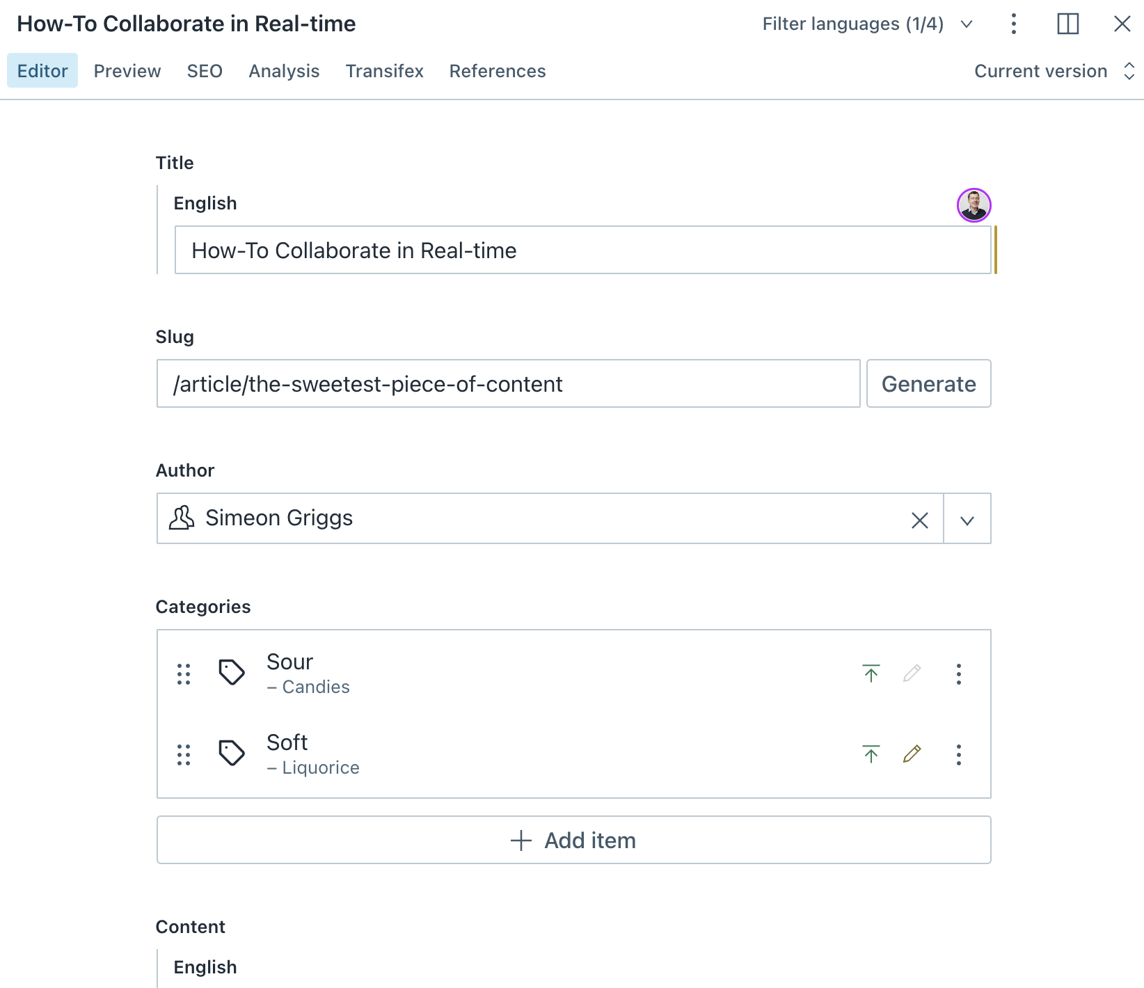
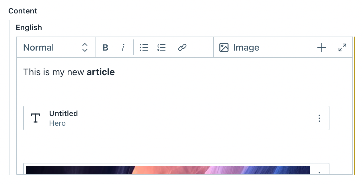
Rich text fields lack label
Problem
In the editor for articles, there are rich text fields. They are marked up as text fields with role="textbox", but have no accessible name. This role requires an accessible name.
Solution
Add an explicit accessible name to the field. This is how assistive technologies like screenreaders and voice control will call this field.
An accessible name can be added directly on this field with aria-label, or it can be named by some other element on the page with aria-labelledby. The latter may be best here; in the case of the screenshot with this issue, the visible label is “Content” (or “English”?), maybe it makes sense to add both of these to aria-labelledby, eg something like aria-labelledby="content language" assuming the elements containing those words have id="content" and id="language".
Having the accessible name match the visual thing is best, this is the expectation for users of voice control too, and of (partially) sighted screenreader users.
Resources

Problem
In the top menu bar there is a button that indicates an update is available. This button does not have an accessible name, which means users with screenreaders cannot know what it is for.
Solution
Add an accessible name to the button, for instance by adding (hidden) text inside of it or adding the aria-label attribute to the button.
Resources